OVERVIEW
Login experience improvement
Redesign Login with new design system
During the rapid development phase, the absence of a UX guide resulted in the Frequence platform lacking a cohesive design system, leading to a chaotic appearance. To address this issue, I am implementing the new Tailwind design system to overhaul the platform, with a particular emphasis on redesigning the Login interface.
Role
In this project, my role primarily involves overseeing the entire project lifecycle, from the early discovery phase to ideation and prototyping, and finally to implementing and reviewing the functionality.
Time Line
02.2023-05.2023
Platform
Web
Goal
By implementing a comprehensive design system and redesigning key features such as the login interface, our aim is to create a more cohesive and user-friendly platform.
Tools
Figma
Industry
SAAS, Marketing, B2B
IMPACT
Impact
The goal of redesigning the login interface was to enhance the overall user experience and streamline the workflow for media companies using the Frequence platform. Through this project, we improved usability, increased efficiency, and helped media companies to focus more on their advertising workflows by creating a more cohesive and user-friendly login experience.
.png)
BACKGROUND
The Challenge
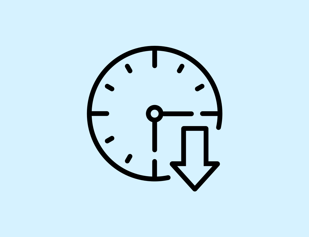
The existing login interface design of Frequence is outdated and lacks features such as password memory and viewing, resulting in users frequently entering their account credentials. Consequently, this increases both the frequency of login attempts and the error rate. On average, users take 32 seconds to complete the login process.
"On average, users take 18 seconds to complete the login process."
BACKGROUND
The Solution
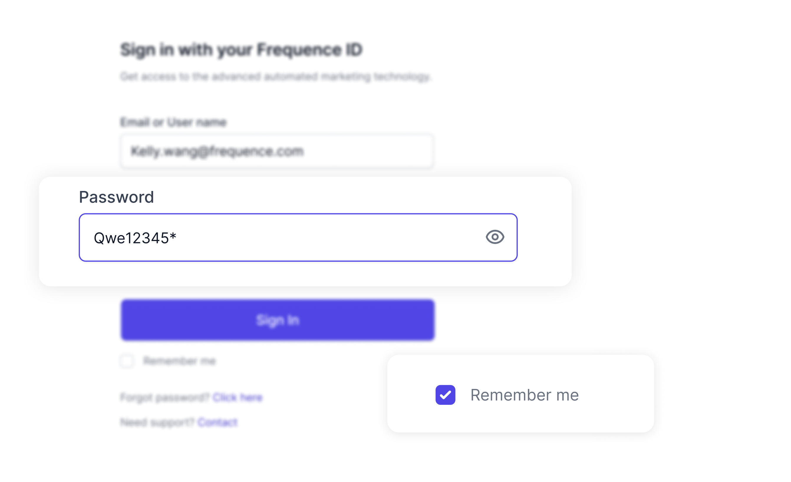
The addition of the "Remember Password" feature eliminates the need for users to frequently input their usernames and passwords. Additionally, users have the option to exchange between displaying and hiding passwords, reducing the error rate. The goal is to streamline the entire login process and keep the average time spent within 10 seconds.
"The goal is to streamline the entire login process and keep the average time spent within 10 seconds."
DISCOVERY
The Process
The UX process at Frequence is based on the Double Diamond Theory and Lean UX process. UX team aim to incorporate the key phases of Discovery, Definition, Ideation and Implementation in all of the projects.

DISCOVERY
Research
· Talking the initiative with PM
At Frequence, it's the PM who will start the initiative. By talking to the PM, I get the requirements as below:
Cohesive Design
The new login feature will ensure that the login page aligns seamlessly with other process pages, providing a unified and consistent user experience.
Visual Appeal
This consistency will also enhance the overall visual appeal of our platform, contributing to a more polished and
professional appearance.
professional appearance.
Reduce Login Barriers
The new feature will streamline the login process, making it quicker and more user-friendly.
· Deep conversations with different stakeholders
After receiving the requirements from the PM, we began meeting with different stakeholders, including the customer success team, customer onboarding team, and operations team, to gather their opinions and feedback about our current login page. We listened to their pain points and their expectations for the new design.
· Analyzing data from the user
Additionally, we analyzed data from users to understand their behavior, challenges, and needs regarding the login process. This comprehensive approach provide valuable insights to help identify the potential problems user encounter and optimize the user experience.
1,239
Total Sign In per day
18s
Average Sign In time
6%
Errors users encounter
12%
Forget password
DISCOVERY
Insight
From the interviews and login data, I learned the insights below:
· User spent 18 seconds per login
A significant portion of our users, specifically 38.82%, did not use autofill functionality in their browsers. As a result, they had to manually enter their credentials each time they log in, which significantly extended the login time.
· Error rate was higher than average
The Input Error rate was 6% and the Forgot Password Request Rate was 12%. Frequence original log in page didn't offer password visibility at all, so users could not see their passwords and were unable to know if they have made an input error. This leaded to a higher than average password reset rate.
· Lower brand trust
The outdated login page design could cause users to lose trust in Frequence. Therefore, providing a good UI was essential to building brand trust.
EXPLORATION
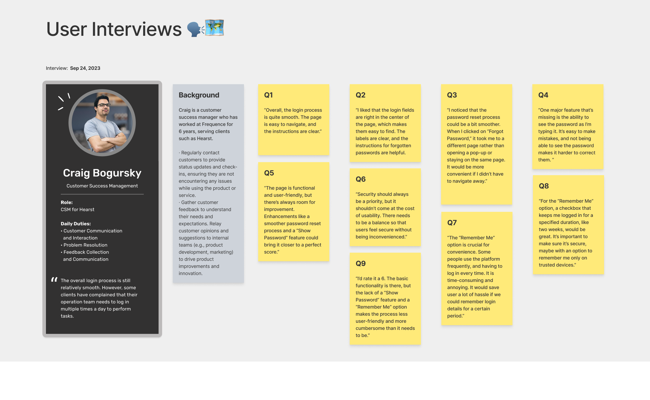
Persona
Personas enable designers to empathize with users and guiding the creation of user-centered solutions by providing a clear understanding of who the users are, what they want, and how they might use the product. In this design, the Sales Representative of the Frequence partners was the primary user and I created this persona to help understanding their needs and behaviors.
EXPLORATION
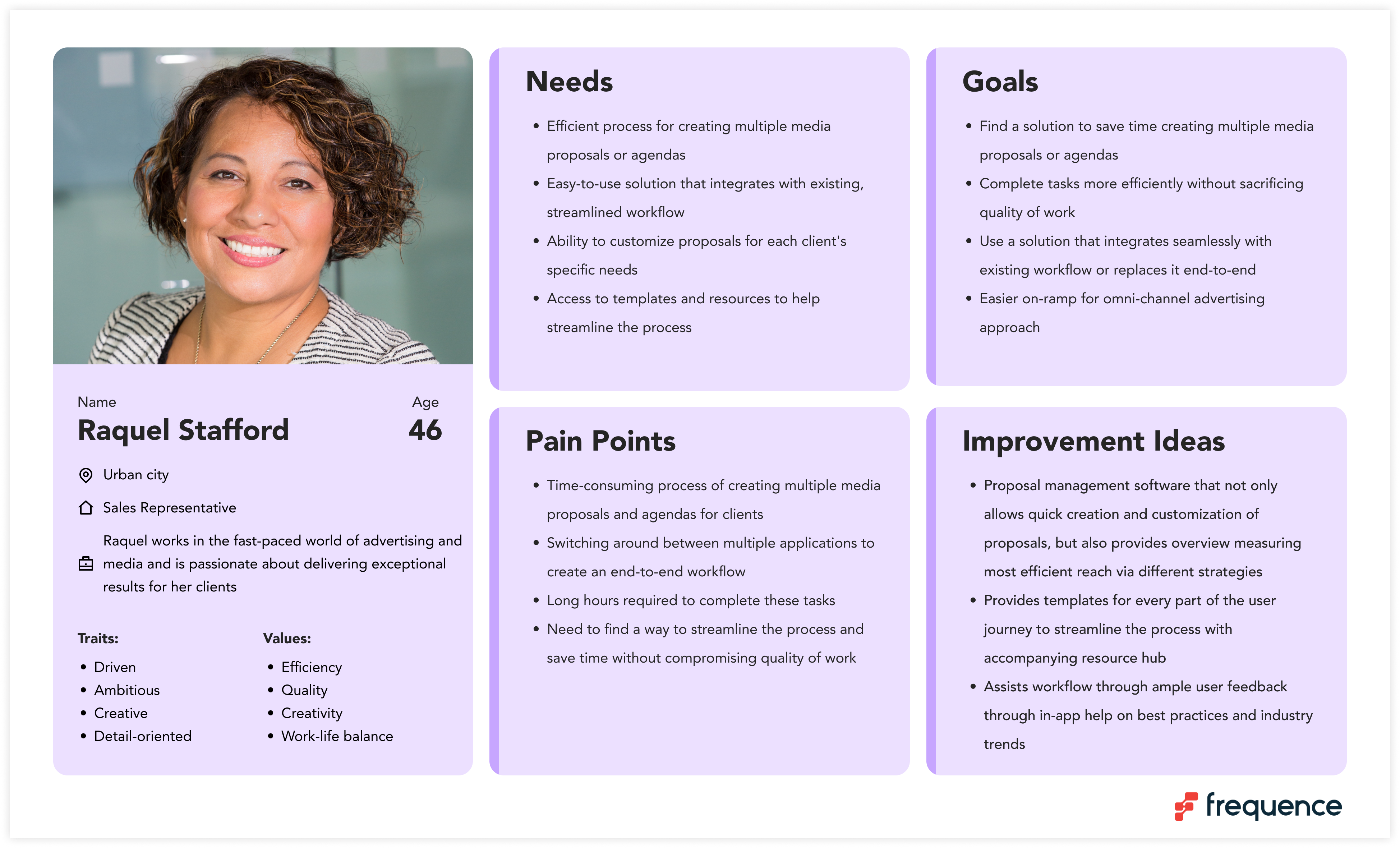
User Flow
Upon successful login, the user is redirected to the main interface. If there is an error, ensure that the process of identifying and addressing issues is simple and straightforward. Users should be able to easily correct the error, reset their password, or connect with the customer service team for support.
EXPLORATION
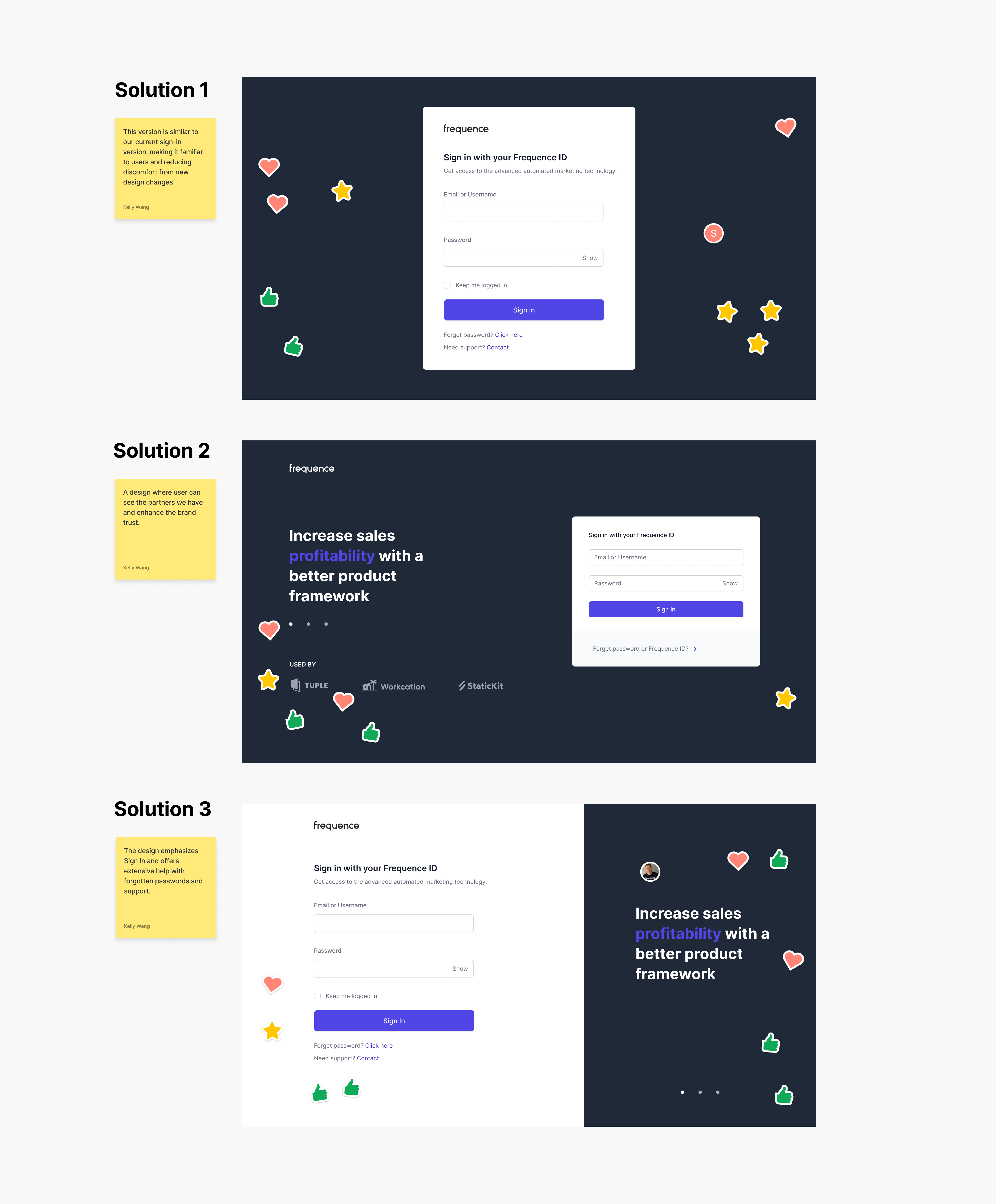
Proposed Solutions
Based on the research and insights, I designed different solutions for our teams to choose from. Since the stakeholders place more value on the visual experience, I created high-fidelity designs to obtain more direct feedback and suggestions from everyone.
Solution 1 is similar to original sign-in version, making it familiar to users and reducing discomfort from new design changes. Solution 2 is a design where user can see the partners we have and can enhance the brand trust. Solution 3 emphasizes the Sign In and offers extensive help with forgotten passwords and support.
I sent the designs to different teams and asked for their votes. Both options 1 and 3 received considerable support. After several rounds of review, solution 3 was ultimately finalized during the presentation to the CEO.
IDEATION
Prototype
After all these research, I utilized the new design system to visualize the design and create a prototype. I then presented this prototype to all stakeholders and executives, aiming to persuade them to adopt this new design.
Problem Solving PROCESS
Optimize the login process within 10 Seconds
Given a scenario where users need to manually enter their credentials and frequently log in without being able to see or verify their password input, the average login duration was found to be 18 seconds. Additionally, the input error rate was 6%, and the forgot password request rate was 12%, both of which are higher than average.
By adding password visibility and a "Remember Me" feature, users no longer need to re-enter their username and password each time they visit Frequence, also reducing the password input error rate. The new design reduced the average login duration from 18 seconds to 8.6 seconds.
HIGHLIGHT
Enhance Customer Satisfaction
The new login feature reduces login barriers and increases convenience, making it easier for users to visit frequently and enhancing user engagement. Additionally, the new login feature built a cohesive interface for the Frequence platform, ensuring consistency between the login page and other process pages. This consistency enhances the visual appeal and further increases user satisfaction. At the same time, it also strengthens brand recognition and reputation, leading to better user loyalty.
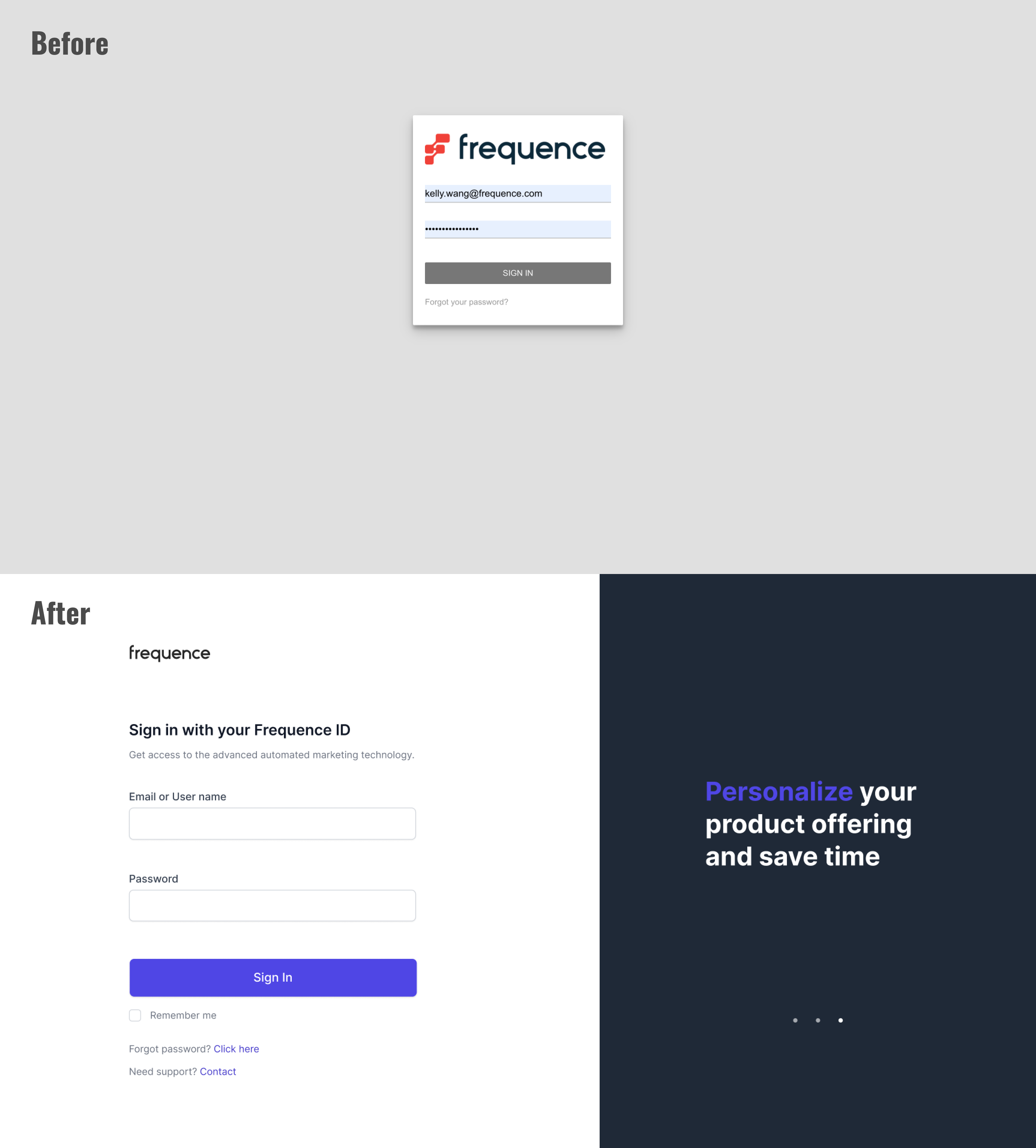
Before
The page looks outdated.
Black shadow makes it look dirty.
I can’t see my password.
Always need manually input.
It takes me 18 seconds
Black shadow makes it look dirty.
I can’t see my password.
Always need manually input.
It takes me 18 seconds
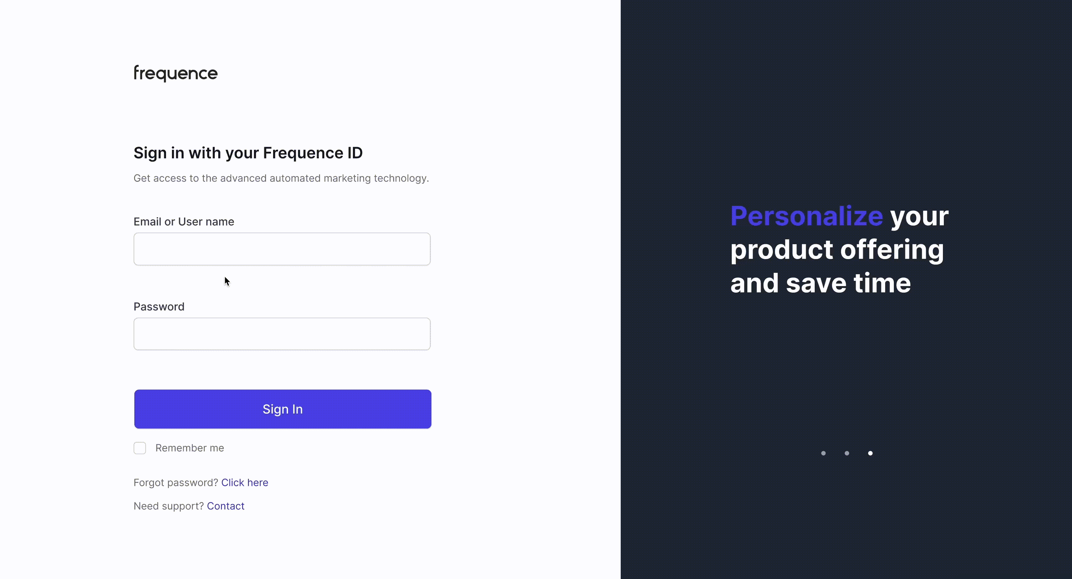
After
The page looks polished.
Clean visual layout.
I can see my password.
I can sign in automatically
It takes me 9 seconds
Clean visual layout.
I can see my password.
I can sign in automatically
It takes me 9 seconds
MEASUREMENT
Results & takeaways
We were able to successfully implement the designs and granted 32 partners to use. And we successfully reduced the average login time from 18 seconds to 9 seconds.
The newly added "Contact Support" feature was designed to make it easier for users to reach customer service and resolve issues. However, this feature was eventually canceled because most customers prefer to directly contact their assigned sales or OPS representatives when encountering problems. For Frequence, adding a customer support email and sorting issues to the appropriate personnel would have made the process less efficient.
The newly added "Contact Support" feature was designed to make it easier for users to reach customer service and resolve issues. However, this feature was eventually canceled because most customers prefer to directly contact their assigned sales or OPS representatives when encountering problems. For Frequence, adding a customer support email and sorting issues to the appropriate personnel would have made the process less efficient.


yuwangdesign@gmail.com